


Meet your new
bodycare routine

NOT YOUR FACE'S
SKINCARE

Both Test
Both Test
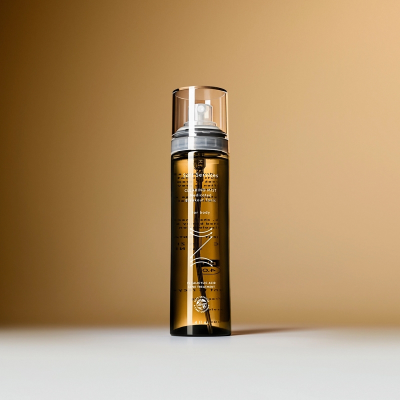
This is an example of a Grid Banner module. In this example, module is a split background color and image – but it could be a video. The text block (black or white) is left aligned. CTA button is optional and always positioned from the bottom under text. There's no H1 on this module since we've used the optional subtitle.

Grid Banner 2
Grid Banner 2
This is an example of a Grid Banner module. In this example, module is a split background color and image – but it could be a video. The text block (black or white) is left aligned. CTA button is optional and always positioned from the bottom under text. This banner could have a large H1 title and it is always white and left-aligned on desktop and mobile.
Grid Banner 3
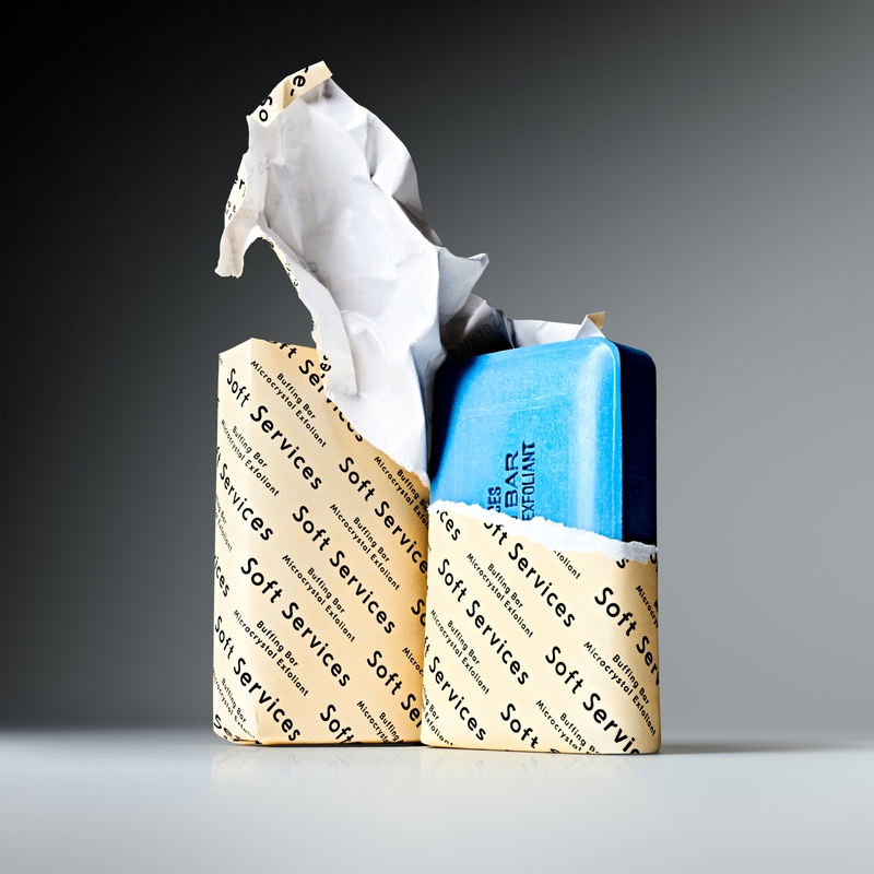
This is an example of a Grid Banner module. Here, I'm using a video but this could also be a still image. This module looks a little shorter because the media takes up the full with and there's no CTA.


Grid Banner 4
Grid Banner 5
Similar to Grid Banner 3, this can be a color, image, or video. Here I've made the photo full width and added the optional CTA and made it a mint color. The full list of color options for buttons and backgrounds is: Bone, Clay Orange, Cool Grey, Mint, Mist Red, Soft Black, and White. Notice this is the only instance where the H1 can be black and centered.

Anything

Flex copy
Before & After Module
This is a Before & After module. The UI text over the image can be white or black. Captions can be white or black. Behavior is a click, not a slider. Title + caption is unique to each state (before and after). Images are here but they could also be videos.
Grid Media Module

Grid Poster
This is an example of a Grid Poster module that is "featured". When this module is toggled to "featured" it just means it's bigger on desktop. There's no bold or CTA on this module. This can have and large top and bottom title (can live independent of each other) and a media that is a photo or video.
Featured
Grid Poster
This is an example of a Grid Poster module that is not featured. This can have and large top and bottom title (can live independent of each other) and a media that is a photo or video. In this example I've just used a background color to show the text can also be black.
Normal
This is an example of a Grid Text Block module that is featured. Featured means the CTA and text is centered and there's a little more padding on both desktop and mobile. This module can have an image/video background but I've only used a background color here. We can have an optional corner icon: current options are recycle, camera, eye, and pin. We can also have an optional CTA.
This is an example of a normal Grid Text Block module that is not featured. Text and CTA are left aligned. This module can have an image/video background or a background color here. We can have an optional corner icon: current options are recycle, camera, eye, and pin. I haven't included here. We can also have an optional CTA.
Grid Text Blocks don't have headings but we can:
- make lists and bold things
- add x's
- add checks but they will be black
We've used these blocks on landing pages to hack reviews in the past.
Here's a simple Grid Text Block just saying that the below module is an Interstitial module that's used as a spacer and that can be animated or not. We can in theory add any image here is as spacer but only the logo we've designed into will animate with the desired effect.
Here's another simple left-aligned Grid Text Block just saying that the below modules are product cards. Only sets that are set to "featured" will be displayed as a full block on desktop. This has no effect on mobile view.
Empty Test